Friday, 24 December 2010

Step By Step of the Magazine Cover

Step one- add the background image which is the same image as the film poster. This has been edited on photo shop as I have adjusted the brightness and saturation and moved them to low.


Step two-I added a black border at the bottom which says "Win 2 tickets to the insomnia film premiere."This is in red font made to stick out from the dark background.


Step Three-I added the title of the film towards the middle of the left hand side of the page. This is the same font as the film poster I have used, this is because then if the customers see this magazine they will understand what film it is because it will be familiar.


Step four- I added the main part to my mast head which is the title of the magazine which is Film. this is a bold white title which sticks out with a modern day font.


Step five- Added the weekly part to the title in the top part of the f of the title saying "film." This I feel looks professional and this is similar to what modern day magazines do.


Step six- I have added the barcode to the bottom of the page this is important as without a barcode this would mean that the customers will not be able to buy the magazine.


Step seven- I have added all the main text down the left hand side of the page. This says " Heads up out Ultimate Winter Preview starring...Scream 4, Nightmare at Home, Halloween, Fade to black, Evil lies beneath." This text has a mixture of white and red to make it look professional and keep between the red white and black colour scheme.


Step Eight- I have added below the title "December Edition" this is the date when the magazine is out. This is a white font and looks modern due to it being a default font on photo shop.


Step Nine- Added Pug at the right hand side of the page below the film weekly title. This is a mixture of red and white colour. Inside the pug the writing says "Win a day out with orlando bloom-see inside for details."


Step Ten- I have added a banner at the top which is also red and this says "The Modern Guide To Films." This is a bright font and is red so it sticks out which I feel that this does well.


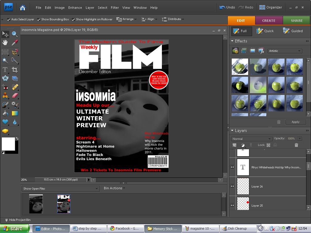
Step eleven- Finally i have added text on the right hand side of the page saying " Rhys Whiteheads hot tip-Why insomnia will rock the charts in 2011." This is a mixture of red and white font which is also bold so that this sticks out well for the customers to see and read.

Step By Step of the Poster


-The first step was getting the main image on to Photo shop. I took a lot of photos basing it with the mask and the house, which is used in the film. I chose this image and will edit this to make it darker.


-The next step was I changed the saturation to -100 making it a black and white picture; then I also changed the brightness low to make the picture look dark and scarier. This is the main image and will be the background to the magazine and poster.


-The third step was to make the top part of the picture black. I did this so that when I put text as this would look a lot better.


-The fourth step was to add the text where I made a gap with the black box at the top. I added the text “The best thriller since the Exorcist” fhm, I made these in capital letters and with white text to make it look bold and professional.


-For the fifth step I have added the title of the film called insomnia. I got the font from a website called dafont.com and the font is a Russian font called Manfred Klein. I thought that this font looks good as it looks abnormal and this is what a scary film is like and I feel that this fits well.


-For the sixth step I have added the date when the film comes out. This is the 20th of February 2011. I used the Champagne and Limousines font on Dafont.com. I used the white font and placed this at the bottom in the middle as this sticks out well.


-For my seventh step I have added the title of the directors from the film. These are Rhys Whitehead, Sam Huggett and Jess Dolan. These have been added below the title of insomnia. I feel this has been placed well and looks professional like a real poster.


-For the eight step I have added the company who make the film RJS productions and the website www.insomnia.com/rjsproductions. I used the text from Photoshop with the Arial font at the bottom to show customers where the main information is needed so they can visit the website to see the trailer, and other features.


-For the final step I have added the catchphrase which will make the audience want to go and see the film and this is “ evil finds a way home” this is what the target audience wanted in the surveys I sent out. This has been shown towards the bottom of the poster and I have used a horror font front Dafont.com called Double featu
re.

Thursday, 2 December 2010

Questionnaire Results

When i created my blog, i had made a questionnaire, i did this so i could see what my target audience was interested in. In doing this, i found out what there likes and expectations are for a movie.
The questionnaire has helped me greatly, as it has allowed me to get feedback of what my audience thinks of my ideas and interests, also i could see what my target audience liked.
The questions i asked where simple, so i could just get a general idea.

The first question, had asked was if my target audience was male of female, these answers resulted in a very unbalanced style with Female being 3 and male being 8, this isn't as good because there is not a clear distinguish between the gender audience, this means that I cant distinguish a mixed opinion of gender.

Another important question i had chose to use was what age are you? This would tell me that roughly what age my target audience, this gives me an advantage as i could find ways to appeal to their age group. The answers resulted in the majority being 16 to 19, This is with 10 votes and 1 vote for 25+.This question results feedback was also good, and worked to an advantage for me, because the majority vote went towards older teenagers. I think this is positive feedback because of this age group, they are able to appeal to an more of an intellectual standard then what most younger teenagers would do.

Another important question I asked was to ask what genre of film was most popular amongst my target audience, All the votes were mainly based on comedy and Horror as comedy had 7 votes and horror had 4 votes. This isn't good as this is what I didn't want from my target audience, this is not good and I feel that I will dissatisfy my target audience when i choose to do a horror movie.

Another question I asked was what type of music they prefer in a film. Majority of the customers said they prefer both fast and slow music in a film. Also a lot of the customers wanted fast paced music in the film too. Fast music got 5 and both slow and fast got 7.

A very important question which I asked was Which catchphrase do you prefer. I chose 4 catchphrases which are going to be used in my magazine cover and poster, I will be using one of these and I have let my customers decide which one is best. The top 3 choices where, evil find its way home, Rest in Pieces, Evil will do anything to live. Majority of the customers thought that Evil finds its way home the best catchphrase and I got 5 votes from that, I got 4 votes for Rest In Pieces, and 3 votes from Evil will do anything to live.

The penultimate question I asked was where would you prefer a horror movie to be filmed at. Majority of the customers believe that filming in a house is the scariest as 7 customers out of 12 voted this. 2 viewers voted that a forest is a scary place to film and 3 viewers were undecided and voted none of the above.

The final question I asked was what colour scheme do you prefer for the magazine and poster. I got majority of the customer target audience say that red,black and white is the best colour scheme as 7 people voted this. Second was blue,black and white with 3 votes and then red,blue,white with 2 votes.

With all these questions I have asked my target audience, I will choosing what the majority of them wanted to see in a horror trailer. This is because then they would want to see this film as they will like what they prefer to see.


Font ideas

For my film I need a house font which is continued throughout the advertising and promoting of the film. This is important which font is used as this will make the customers remember briefly what film this is. An example is the spiderman font, this font is a catchy font which if people were to see it now they would think that it is spiderman font. For my film I have to get a font which is catchy and professional looking. I have searched on a website called www.dafont.com and this is a website which has a few different designs. I have chosen a few designs, and I will be deciding which will be the main font for my film, magazine and poster.


-I think this font looks good, but I feel this doesn't look like a horror type font. I feel this would be good to place as the catchy slogan to promote the films by giving the customers a quick taste of what the film is about.


-I like this font as I feel this can be a horror type. I feel that this is bold and sticks out if it was on the front page of a magazine or a poster.


-I like this font as I feel this could be a possible font for my final design as it is a fairly modern style font which I am looking for in my poster and magazine.


-This is one of my favourite fonts as it is very bold and sticks out very well which I want for the poster and magazine cover.


-I like this font as I feel that this is very modern and is the type of font I want for my magazine and poster.


-I think this font is a very good font for a horror. I feel it sticks out well for a horror. I feel that this isn't one of my favourite fonts as I feel for my type of magazine I feel it isn't the type of font I want.

I have chosen Motor oil 1937 as this font looks the most professional and will succeed in making the film successful in the marketing industry. I also have opted to choose a big style magazine such as Empire magazine as the design, where I feel this font is the best font to do this style compared to the horror magazines which are set to one specific genre, I feel "Were Beast" font will suit this well.

Film Name Ideas

For any film in any genre across the media the most important factor to the film is to have a title, this title is the name of the film. The film name has to be catchy and has to represent well with the genre of film you are basing your film on. A good example of a film title is the film Scream, this is a good example as the film is made for you to get scared and scream, also a film like Wimbledon this film is about tennis and Wimbledon is a big part of tennis as a tournament for example. I have chosen 4 different titles and I am going to choose one for my film:

- Fade to Black- I have chosen this one as I feel for a horror film dark is a key factor and a fade to black is almost like people dying. I feel this is a good title and I might use it as a final for the film.
-Insomnia- I like this idea of a film name as I think that it sounds like a gripping horror film which is very lively. Insomnia means you can't sleep and I feel that this is a good idea for a film name as the characters in the film won't be sleeping as there will be too much drama.
-The House of Nightmares- This is also a good name for a film as I believe that this is a good name for a film as this title somes up what my trailer is about. I dont think this is as good as others though as I feel it is too stereotypical, as I want a title that sticks out from the other horror films like Scream and Halloween.
-Repulsion-For the final title I have chosen for my ideas I have chosen Repulsion and I feel that this sticks out well from the other film names as its a catchy word which resembles horror but in an unconventional way.

For my film I am going to choose Insomnia as I feel it is the film which I will be more likely to relate well to the film and I feel it suits the type of film.

Wednesday, 1 December 2010

Poster Research

To promote a film well, there are many conventions that are needed to promote the film well. Conventions to promoting it are in the media, for example magazines or posters. I am creating a poster and I have been researching different film posters that represent well with my horror genre and the type of film I am doing. I have chose three film posters which I like and feel represent well with my media film. I have chosen a scream 4 poster, Halloween Resurrection and The Amityville Horror.


For the first poster I have analyzed is scream 4. I feel this is a very simple but good designed layout. This is because there is little on the page and I feel there doesn’t need to be. This is because the scary mask which a lot of horror fans will be aware of will understand and know what film this is straight away. Also there is a house style and house colour involved here as the scream masthead has been used throughout the four films and it is used here. The layout is very simple there is a morel story to the film which should be remembered which is catchy this is placed at the top saying “New Decade, New Rules.” The masthead is place towards the bottom, and the date of when the film is coming out is also shown at the bottom. Also I like that there is a very basic colour scheme of just three simple but very effective colours of black, white and red.


For the second poster this is Halloween Resurrection. This is also I feel a very simple but effective layout. This I feel is slightly similar to the previous poster I analyzed as I feel the main image is very similar. But this is different as this mask is slightly different as horror fans would be able to tell the difference from the Scream mask to Michael Myers mask. I feel the morel catchphrase in this poster is more effective as It is going across his mask. The masthead is placed at the bottom of the poster also the date of when the film is coming out. I feel this is a good poster but I feel that it is not as classy looking than the scream mask.

For the final poster I am going to analyze is The Amityville Horror. This I feel is a very much different poster compared to the other two I have analyzed. The main image is different as it is an image of a serial killer walking to a house. This I feel is a good image for what I could possibly do for my final poster for my film. The morel catchphrase is at the top of the page. The masthead is placed just below the serial killer towards the bottom of the page. At the bottom there is all the credits from the producers, people in the film etc. I feel the colour scheme isn’t as good as the previous to as there are to many colours what I feel don’t promote the poster and film well. Also another problem in this is there is no date when the film is coming out. I feel this is vital as this would make people know when they can go to the cinema to watch it.

Overall I feel that the scream poster is the best poster as I feel that it is simple and effective, very similar to what I want to do for my final poster. I like the colour scheme and I feel this is enough advertising for the customers to know what film it is.


In order to present an effective movie magazine which follows the conventions, I have used research and knowledge to grab a basic idea for a magazine cover. I have selected below a couple of magazine covers which suit the genre I am doing. These two magazines I have chosen are three magazines what are in a niche market in America. These are Fangoria, Scream and Empire.

Fangoria is a horror film magazine which by the name of the magazine you can tell it is going to be something about a creepy nature. The layout for the magazines is pretty basic. This is of the masthead being pretty big going across the whole top of the page. Above the masthead is a small banner. At the bottom there is the logo of the film where the main picture is taken from, a small pug is placed towards the bottom of the magazine, with the barcode being below the pug. The main image is placed in the conventions showing that it is in the middle.

For Scream magazine this is also a horror magazine which contains clips and reviews from horror movies in the market. Like Fangoria there masthead is very big and clear to see, this is shown in a blood looking font. The layout is slightly different to Fangoria as there is no barcode; the colour scheme seems odd as there are far too many colours and patterns used. There is no proper writing to show where this main image is from, compared to Fangoria where the main image was caped below with the title of the film. At the bottom of the magazine there is a list of many horror films in the banner

For the final magazine cover I have chose to analyze I have chosen Empire magazine, as Empire magazine is one of the most famous magazines for films in the marketing industry. The layout of this magazine is to a much higher modern standard. This is because the empire magazine has a house style masthead so that customers can remember the magazine. The layout is good as there is a banner at the top saying to famous movie producers. A pug is shown towards the top right, The main image is capped below with the film title clear and bold for people to see, there is also description of what is included in the magazine.


I feel empire magazine has the highest class. I feel I will want to use the empire style magazine although they don’t always base it around horror. I believe this because I want to grab a big variety of audience and I feel this will be a good way to promote the film.


Re Shoot

As my first batch of filming i did for my horror trailer there were a few errors. I have made this list below of what went wrong and when i will re shoot the footage:
Shot Number 1
Shot description-Opening door scene.
Problem- Couldn't get the right angle.
Re shoot date-25th November 2010.
Shot Number 2
Shot description-Opening scene lights.

Problem-Lighting

Re Shoot Date-25th November 2010.

Shot Number 3

Shot description-Car scene

Problem-couldn’t get the right time for the killer.

Re Shoot Date-25th November 2010.

Shot Number 4

Shot description-Running Scene

Problem-Main protagonist falls over.

Re Shoot Date-25th November 2010.

Shot Number 5

Shot description-Living room scene when character walks to toilet.

Problem-Acting not good enough.

Re Shoot Date-25th November 2010

Tuesday, 23 November 2010

Problems with filming

One of the main problems I had when it came to filming the trailer was getting the characters needed in the trailer to be there at the same place at the same time due to them being busy for other things such as work or school work. To solve the problem we made sure that all of the cast would make sure that everyone was free for 2 full filming days and one more just incase we needed to film extra shots. This was still a problem as one person from my group weren’t able to make the first day and the other came half way through the filming due to being busy. But I managed to make a start on the filming as I felt that we were getting behind task. Another problem we had when we filming were the lighting. As my trailer is a horror a stereotypical horror film is now filmed in the dark and we have filmed some scenes in the dark as part of the storyline is where the lights in the house go out.

Monday, 22 November 2010

Storyboard

Box 1- The first box shows the MPAA logo which is shown at a lot of movie trailers. In the trailer there will be a green background and this means that there won't be no violence or nothing bad in it.
Box 2-Here I will show a logo which I will create which is the RJS productions logo.

Box 3-Scene on the sofa protagonist couple watching a film.

Box 4- Cuts to the power cut.

Box 5- Text inserted here to build up the tension.

Box 6- Cuts to a shot of women protagonist on sofa in dark, with the killer looking through the window.


Box 7- Text is inserted here to create tension.

Box 8-Scene of the protagonist turning the fusebox on whilst the door next to him theres the killer without him knowing.

Box 9- More Text to create more tension.

Box 10- Protagonist girl on the phone to friends inviting them round to the house.

Box 11- Scene of two friends entering the house.

Box 12- Scene of the killer standing in the doorway in the house.
Box 13- Scene of the friend washing hands in toilet, killer is looking through the mirror and grabs him.

Box 14- Scene of other friend looking for other friend. In shock as he see's what has happened to his friend, the killer then appears next to him.

Box 15- Text to create more tension to the film trailer.

Box 16- Scene of both the protagonists running to the car to get away.

Box 17- Scene of the Killer climbing on the car as the two protagonists are petrified.

Box 18- The Title shown here with the name, date of it coming out, website, certificate.
Box 19- Final scene of the women protagonist getting dragged down the hallway.

Film location

For my trailer I am using one location but shots in a variety of scenes in the area of that location. Our main location is set in my house as this is where most of the action will be filmed. By setting the main location to the house I feel this is will associate with the audience well as they would start to believe whether this would happen to them in real life, and this would make it feel a lot scarier. As our trailer is based around a friends gathering round a house then it getting rudely interrupted by a killer, we will be using specific props within our trailer again making our trailer believable to the viewing target audience. I feel as an improvement I will be trying to add a few more shots at a different location as this would make the film look a lot more realistic. Below are some of the pictures I have taken to show where some of the shots have been taken.


Thursday, 4 November 2010

Moodboard

Here is my moodboard for the film trailer I will be producing. I have shown a few clips of footage from other horror films such as Halloween, paranormal activity and Quarantine. I have shown clips like a women getting dragged across the floor. Also other clips of a woman standing in the doorway whilst being possessed. Other clips are of a scary villain looking down at the stairs with a knife in his hand, and also a scary villain looking out the window. And the final clip I have shown is a women chasing away from a villain only to be captured by him. All these clips are similar to what I want to show in my movie trailer.

Movie Ideas

Setting-
-Church
-Grave Yard
-House
-Lake
-Forest

Colours-
-Red-Shows blood, danger.
-Black-Shows death,darkness
-White-Shows mist,paranormal effect.

Masks-
-Masks.
-Tribal effect.
-Halloween Style.
-Michael Myers mask.

Sounds-
-Bangs.
-Eerie winds.
-Screams.
-Thuds.

Clothes-
-All black costume.
-Cloak.

Weather-
-Raining.
-Cold
-Dark misty.

Other-
-Scary Eyes.
-Hide and Seek.


Thursday, 21 October 2010

Target Audience


The target audience for the film I have chosen to produce is teenagers from the age of 15 and above, this allows the certificate to be 15. This allows us to get a wider range of audience which allows violence and gory scenes. We have specifically focused the age groups from fifteen to the early twenties/late twenties. I have chosen this as the younger generation will not be as aware to the conventions of horror movies, where as the elder generation will understand it fully and this may mean that they might be able to predict what’s going to happen next and this would be a problem as we won’t get as many people watching it. I also feel that having the certificate at 15 this allows the younger teenagers from 15 years old to see a popular genre and there age which is a horror and it is a common factor that young teenagers like to go the cinema with there friends.

This is Leon he is 19 years old and he attends Thames Valley University in London. He is an example of my target audience for the film trailer I am producing. Leon enjoys attending gigs, music and film festivals. He regularly attends the cinema as he lives local to one. His favourite genre of film is horror. He also likes to arrange movie nights with his friends. In university he is studying media production, this is working on editing. His life time ambition is to become a famous movie producer/movie editor. Leons favourite movies are scream 1, 2, 3, and all the Halloween films.


Thursday, 30 September 2010

Freytag's Triangle

Gustav Freytag a famous German 19th century novelist. According to him drama is divided into five parts, or acts which some people refer to as a dramatic arc, the five parts are exposition, rising action, climax, falling action, and denouement. Although Freytag’s analysis to dramatic structure is based on plays and shows, this can also be modified for short stories or trailers as such.

Exposition

The exposition provides the background information needed for people to understand the story, like who the protagonist and antagonists are, the basic storyline and the setting. It ends with an inciting moment, which is the incide

nt without which there would be no story. The inciting moment sets the remainder of the story in motion beginning with the second act, the rising action. Exposition the two are not perfectly synonymous.

Rising action

During rising action, the basic internal conflict is complicated by the introduction of related secondary conflicts, including various obstacles that frustrate the protagonist's attempt to reach his goal. Secondary conflicts can include adversaries of less

er importance than the story’s antagonist, who may work with the antagonist or separately, by and for themselves or actions unknown.

Climax

The third act is that of the climax, or turning point, which marks a change, for the better or the worse, in the protagonist’s affairs. If the story is a comedy, things will have gone badly for the protagonist up to this point; now, the tide, so to speak, will turn, and things will begin to go well for him or her. If the story is a tragedy, the opposite state of affairs will ensue, with things going from good to bad for the protagonist.

Falling action

During the falling action, or resolution, which is the moment of reversal after the climax, the conflict between the protagonist and the antagonist unravels, wi

th the protagonist winning or losing against the antagonist. The falling action might contain a moment of final suspense, during which the final outcome of the conflict is in doubt. Which is also the outcome of what happened in the rising action and the climax. Summery: The falling action is that part of the story was the main part (the climax) has finished and you're heading to the conclusion.

Falling action

The dénouement comprises events between the falling action and the actual end of the drama or narrative and thus serves as the conclusion of the story. Conflicts are resolved, creating normality for the characters and a sense of catharsis, or release of tension and anxiety, for the reader. A comedy ends with a dénouement (a conclusion) in which the protagonist is better off than at the story's outset. A tragedy ends with a catastrophe in which the protagonist is worse off than at the beginning of the narrative.


Camera Angles
At the beginning of the trailer straight away there is a oblique shot of the camera upside down with a pan of the Manhattan skyline. After this shot the first shot proper shot of people in the trailer there is a tracking shot of a soon to be victim for "The Devils." At 1.20 there is a close up of one of the characters looking petrified of what is happening. From 1.35 to 1.37 there are high angle shots from looking at the CCTV of the 5 characters in the lift, this could show that they are all in a trap from something much more powerful than them. Throughout the rest of the trailer there are low angles shot showing them in a fight and over the shoulder shots of firemen and rescuers trying to open the lift with chainsaws and crowbars.

Editing
throughout the trailer of "The Devil" there are a few scenes of editing sequences. At the opening of the trailer there is editing of the camera where they have filmed the opening pan of the city(New York) upside down. This sets an unorthodox feeling to this film. From 0.55 to 1.01 there is an editing sequence of a birds eye view of the camera going down the lift, this is whilst there is text saying "Everything Happens For A Reason." From 1.38 to 2.05 there is text then there is tense music and about 5-7 clips then text again to build up the tension.

Characters
For The Devil the main protagonists of the film trailer are the five in the lift. These are four people who usually work at the building where the lift is at. Also there is a security guard who works at the building. These five are the main characters which the film is based on but there is also the security guards who are watching the protagonists problems on CCTV whom are also a big part to the film as they are trying to help them.

Plot
The Devil is about 5 Philadelphia office workers going into the elevator of an inner city office building. But a typical day at their office takes a sudden detour into terror when the elevator becomes stuck between floors. Soon after they are having problems they realise that one of them in the elevator is a devil. During this occurrence the emergency workers are working frantically to free them.
Location
The location of the devil is filmed in a Philadelphia city building. The majority of the film is filmed in the elevator. If it is not filmed in the elevator it is still filmed in the same building

code of clothes/costume
The Five main protagonists in the film are all wearing clothes on what they wear in the everyday lives. This is a smart casual dressing, of what they wear for work. This is a suit for what the 2 men in the lift and a blouse and shirt for the 2 women in the lift. Also there is the security guard in the lift as well, and he is wearing his uniform. Also the staff outside the elevator they are all wearing a smart casual clothing also.


Camera Angles
At the beginning of the trailer, there is a long establishing shot of a house/farm through a crop field. Then we see a high angle shot of the town where the film is based at which is a small town in America. We then get to see a close up of fans enjoying a local baseball game. From 0.22-0.26 we get a shot reverse shot with an over the shoulder shot of a policeman and a man with a gun. At 30 seconds we get a birds eye view shot of the "crazy" man on the floor dead with the policeman checking if he is dead. We get to see a medium shot of the couple who are the protagonists which are the policeman and the nurse.Throughout the rest of the trailer we get over the shoulder shots of the characters and low angle shots showing the characters struggling with a fight.

Editing
Throughout the trailer there are a few editing sequences. For the first 15 seconds they show one clip per every second, this builds up the tension and in the trailer it shows a nice peaceful little town which will soon turn to hell by it showing a "crazy" character walking onto a baseball pitch with a shotgun. At 38 seconds there is an editing sequence where they show some text from a little pause of the clips being shown. Then a slight drilling sound effect followed by about 5-7 quick edit clips in the space of a second. The same editing sequence occurs when a little interval shown with text happens then a quick edit of 5-7 shots in a second occur. At 1.16 there is an editing sequence of shots of the police officer walking down a deserted street of the town where at the beginning of the trailer there are people happy walking down there. This is shown with a buzzing sound with a quick black out effect. From 1.46 to 2.21 there are clips shown quickly from about 2 every 1.5 seconds shown to build the tension up of the film trailer.

Characters
The characters in "The Crazies" are most of the town village. This is because the storyline is about the whole town getting invaded by a disease which makes them go crazy. Throughout the trailer they are all shown in the village. The main protagonists in the film is the Police officer and the Nurse. These two are a couple and throughout the trailer it shows them two in problems of themselves.

Plot
The Crazies is about a small village in Iowa, the village enjoys a local high school baseball game. Deputy Russell Clank spots a local resident entering the outfield holding a shotgun. The sheriff is forced to shoot and kill the unresponsive resident. The sheriff and his wife, the community doctor, begin to notice other town residents exhibiting strange and bizarre behavior. Then the next night a local farmer burns his house down with his wife and son trapped inside, killing them. Communication services are lost, and soldiers arrive and take all residents for containment at the high school. Everyone entering is examined for symptoms of infection. Judy the sheriffs wife does not pass the examination and is separated from the sheriff David. She explains her fever is due to pregnancy, but is sedated anyway. She wakes strapped to a gurney as the perimeter of the facility is breached by the infected. The military personnel evacuate, leaving Judy and others behind. David is nearing evacuation, but escapes and rejoins Deputy Russell. They rescue Judy and her hospital assistant Becca.

Location/Setting
The Crazies is filmed in a small village in America called Ogden Marsh in Iowa. The whole film is filmed in the same village. Throughout the film there are clips which have been filmed in Hospitals, farms, police stations and many others places throughout the small village.

Costumes/Code of clothing
The two main protagonists the Sheriff David and Judy the Nurse and his wife are both throughout the film and the trailer are wearing there work clothes. David is wearing his sheriff uniform and Judy is wearing her nurse uniform.