 This is the film poster I have made for my film. I have used the same image as the magazine front cover and this is of the mask used in the trailer and the house where the film is filmed and the action happens. For my target audience i have kept to the words and kept the colour scheme which is black white and red. This will please the target audience as they will then want to look at the poster and think that this is good. I have used a banner at the top of the page which says "the best thriller since the Exorcist,fhm." The main font I have used for the poster is a Russian font which I thought would work well with the horror theme as this make its look scarier with some of the letters backwards, I have used this font and made the colour of this white to blend in well with the background. Below the masthead is the 3 names of the people who made the films which is Rhys Whitehead (me), Sam Huggett and Jess Dolan. On the main image I have made sure that nothing intersects it as I feel this would make the poster not look as professional as it could. I have made sure that there is nothing there and I have put most of the writing at the bottom. This is the morel to the film which is a sentence which should be catchy and make customers feel either scared or convinced to see this film. The catchphrase to this film is "evil finds a way home" I have made sure that this sticks out well and I have made the text red so that it sticks out, also the font I have used is from dafont which is a blood font with blood dripping down. Below the catchphrase I have the date the film comes out which is "20th February 2011"this has been made with the default font on photo shop I feel this sticks out a lot as well as its bold and big and sticks out. At the bottom of the page I have included the website and the company name at the bottom of the poster which says "rjs productions www.insomnia.com/rjsproductions" this has been made with the default font on photo shop. I feel this poster looks professional and I feel my target audience will like this poster as I have included what they wanted in there and this is the colour scheme, picture and the catchphrase where I gave my target audience a few options and they chose there favourite one which is "evil finds a way home."
Monday, 3 January 2011
This is the film poster I have made for my film. I have used the same image as the magazine front cover and this is of the mask used in the trailer and the house where the film is filmed and the action happens. For my target audience i have kept to the words and kept the colour scheme which is black white and red. This will please the target audience as they will then want to look at the poster and think that this is good. I have used a banner at the top of the page which says "the best thriller since the Exorcist,fhm." The main font I have used for the poster is a Russian font which I thought would work well with the horror theme as this make its look scarier with some of the letters backwards, I have used this font and made the colour of this white to blend in well with the background. Below the masthead is the 3 names of the people who made the films which is Rhys Whitehead (me), Sam Huggett and Jess Dolan. On the main image I have made sure that nothing intersects it as I feel this would make the poster not look as professional as it could. I have made sure that there is nothing there and I have put most of the writing at the bottom. This is the morel to the film which is a sentence which should be catchy and make customers feel either scared or convinced to see this film. The catchphrase to this film is "evil finds a way home" I have made sure that this sticks out well and I have made the text red so that it sticks out, also the font I have used is from dafont which is a blood font with blood dripping down. Below the catchphrase I have the date the film comes out which is "20th February 2011"this has been made with the default font on photo shop I feel this sticks out a lot as well as its bold and big and sticks out. At the bottom of the page I have included the website and the company name at the bottom of the poster which says "rjs productions www.insomnia.com/rjsproductions" this has been made with the default font on photo shop. I feel this poster looks professional and I feel my target audience will like this poster as I have included what they wanted in there and this is the colour scheme, picture and the catchphrase where I gave my target audience a few options and they chose there favourite one which is "evil finds a way home."

Magazine Cover
 This is my magazine cover I have made for my film. The main image I used was of the mask we used in the film. Also I used the background image of the house where all the action happened. After analysing several magazines searching for film titles we chose to call the magazine Film weekly. I chose this because I feel that this would attract a wider variety of audience. I feel it would do this because the magazine I have made is for all types of film lovers where as most horror magazines are made for just horror films and the audience here is not as big. I used a colour scheme of black white and red which all the users wanted. This will be the house style for the magazine. In the magazine I have added text which has a mixture of red and white colours to make the layout professional. I used a banner at the type with red writing saying "The modern guide to films." Below the title I have used a small modern default font on photo shop in white saying "December Edition." I have included a pug with a red and white design inside the pug it says " win a day out with Orlando bloom check inside for details."My main background image i have edited on photo shop which i have made a lot more darker and changed the saturation levels to low so its black and white. I feel this looks good and this now can relate to the targets audience of having a colour scheme of black white and red. At the bottom of the page I also have a banner there and this says "win 2 tickets to insomnia film premiere." The main writing on this page is up the left hand side of the page where this has been made on photo shop with the default font and this says " Heads up our...Ultimate Winter Preview...starring Scream 4, Nightmare at Home, Halloween, Fade to Black, Evils lies Beneath." Above this I have used the font for title of Insomnia which is on the film poster and this is the Russian font which i found on dafont.com, this font is called Manfred Klein. Also I have included what you need in most magazines for customers to buy it at shops and this the bar code and price of the magazine this has been placed at the bottom of the right hand side of the magazine. Overall i feel that this magazine looks professional enough to reach the stores for my target audience to read.
Friday, 24 December 2010
Step By Step of the Magazine Cover
 Step one- add the background image which is the same image as the film poster. This has been edited on photo shop as I have adjusted the brightness and saturation and moved them to low.
 Step two-I added a black border at the bottom which says "Win 2 tickets to the insomnia film premiere."This is in red font made to stick out from the dark background.
 Step Three-I added the title of the film towards the middle of the left hand side of the page. This is the same font as the film poster I have used, this is because then if the customers see this magazine they will understand what film it is because it will be familiar.
 Step four- I added the main part to my mast head which is the title of the magazine which is Film. this is a bold white title which sticks out with a modern day font.
 Step five- Added the weekly part to the title in the top part of the f of the title saying "film." This I feel looks professional and this is similar to what modern day magazines do.
 Step six- I have added the barcode to the bottom of the page this is important as without a barcode this would mean that the customers will not be able to buy the magazine.
 Step seven- I have added all the main text down the left hand side of the page. This says " Heads up out Ultimate Winter Preview starring...Scream 4, Nightmare at Home, Halloween, Fade to black, Evil lies beneath." This text has a mixture of white and red to make it look professional and keep between the red white and black colour scheme.
 Step Eight- I have added below the title "December Edition" this is the date when the magazine is out. This is a white font and looks modern due to it being a default font on photo shop.
 Step Nine- Added Pug at the right hand side of the page below the film weekly title. This is a mixture of red and white colour. Inside the pug the writing says "Win a day out with orlando bloom-see inside for details."
Step Ten- I have added a banner at the top which is also red and this says "The Modern Guide To Films." This is a bright font and is red so it sticks out which I feel that this does well.
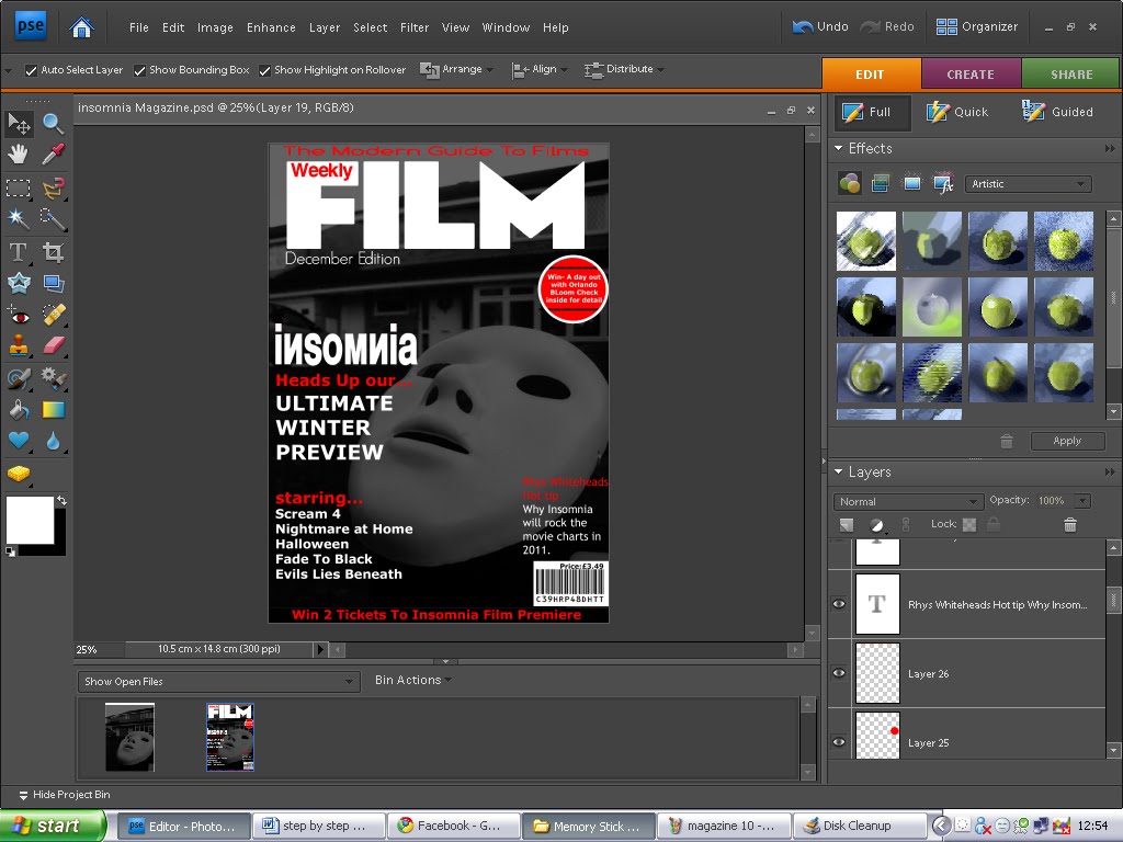 Step eleven- Finally i have added text on the right hand side of the page saying " Rhys Whiteheads hot tip-Why insomnia will rock the charts in 2011." This is a mixture of red and white font which is also bold so that this sticks out well for the customers to see and read.
Step By Step of the Poster

-The first step was getting the main image on to Photo shop. I took a lot of photos basing it with the mask and the house, which is used in the film. I chose this image and will edit this to make it darker.

-The next step was I changed the saturation to -100 making it a black and white picture; then I also changed the brightness low to make the picture look dark and scarier. This is the main image and will be the background to the magazine and poster.

-The third step was to make the top part of the picture black. I did this so that when I put text as this would look a lot better.

-The fourth step was to add the text where I made a gap with the black box at the top. I added the text “The best thriller since the Exorcist” fhm, I made these in capital letters and with white text to make it look bold and professional.

-For the fifth step I have added the title of the film called insomnia. I got the font from a website called dafont.com and the font is a Russian font called Manfred Klein. I thought that this font looks good as it looks abnormal and this is what a scary film is like and I feel that this fits well.

-For the sixth step I have added the date when the film comes out. This is the 20th of February 2011. I used the Champagne and Limousines font on Dafont.com. I used the white font and placed this at the bottom in the middle as this sticks out well.

-For my seventh step I have added the title of the directors from the film. These are Rhys Whitehead, Sam Huggett and Jess Dolan. These have been added below the title of insomnia. I feel this has been placed well and looks professional like a real poster.

-For the eight step I have added the company who make the film RJS productions and the website www.insomnia.com/rjsproductions. I used the text from Photoshop with the Arial font at the bottom to show customers where the main information is needed so they can visit the website to see the trailer, and other features.
 -For the final step I have added the catchphrase which will make the audience want to go and see the film and this is “ evil finds a way home” this is what the target audience wanted in the surveys I sent out. This has been shown towards the bottom of the poster and I have used a horror font front Dafont.com called Double feature.
Thursday, 2 December 2010
Questionnaire Results
When i created my blog, i had made a questionnaire, i did this so i could see what my target audience was interested in. In doing this, i found out what there likes and expectations are for a movie.
The questionnaire has helped me greatly, as it has allowed me to get feedback of what my audience thinks of my ideas and interests, also i could see what my target audience liked.
The questions i asked where simple, so i could just get a general idea.
The first question, had asked was if my target audience was male of female, these answers resulted in a very unbalanced style with Female being 3 and male being 8, this isn't as good because there is not a clear distinguish between the gender audience, this means that I cant distinguish a mixed opinion of gender.
Another important question i had chose to use was what age are you? This would tell me that roughly what age my target audience, this gives me an advantage as i could find ways to appeal to their age group. The answers resulted in the majority being 16 to 19, This is with 10 votes and 1 vote for 25+.This question results feedback was also good, and worked to an advantage for me, because the majority vote went towards older teenagers. I think this is positive feedback because of this age group, they are able to appeal to an more of an intellectual standard then what most younger teenagers would do.
Another important question I asked was to ask what genre of film was most popular amongst my target audience, All the votes were mainly based on comedy and Horror as comedy had 7 votes and horror had 4 votes. This isn't good as this is what I didn't want from my target audience, this is not good and I feel that I will dissatisfy my target audience when i choose to do a horror movie.
Another question I asked was what type of music they prefer in a film. Majority of the customers said they prefer both fast and slow music in a film. Also a lot of the customers wanted fast paced music in the film too. Fast music got 5 and both slow and fast got 7.
A very important question which I asked was Which catchphrase do you prefer. I chose 4 catchphrases which are going to be used in my magazine cover and poster, I will be using one of these and I have let my customers decide which one is best. The top 3 choices where, evil find its way home, Rest in Pieces, Evil will do anything to live. Majority of the customers thought that Evil finds its way home the best catchphrase and I got 5 votes from that, I got 4 votes for Rest In Pieces, and 3 votes from Evil will do anything to live.
The penultimate question I asked was where would you prefer a horror movie to be filmed at. Majority of the customers believe that filming in a house is the scariest as 7 customers out of 12 voted this. 2 viewers voted that a forest is a scary place to film and 3 viewers were undecided and voted none of the above.
The final question I asked was what colour scheme do you prefer for the magazine and poster. I got majority of the customer target audience say that red,black and white is the best colour scheme as 7 people voted this. Second was blue,black and white with 3 votes and then red,blue,white with 2 votes.
With all these questions I have asked my target audience, I will choosing what the majority of them wanted to see in a horror trailer. This is because then they would want to see this film as they will like what they prefer to see.
Font ideas
For my film I need a house font which is continued throughout the advertising and promoting of the film. This is important which font is used as this will make the customers remember briefly what film this is. An example is the spiderman font, this font is a catchy font which if people were to see it now they would think that it is spiderman font. For my film I have to get a font which is catchy and professional looking. I have searched on a website called www.dafont.com and this is a website which has a few different designs. I have chosen a few designs, and I will be deciding which will be the main font for my film, magazine and poster.


-I think this font looks good, but I feel this doesn't look like a horror type font. I feel this would be good to place as the catchy slogan to promote the films by giving the customers a quick taste of what the film is about.
-I like this font as I feel this can be a horror type. I feel that this is bold and sticks out if it was on the front page of a magazine or a poster.
-I like this font as I feel this could be a possible font for my final design as it is a fairly modern style font which I am looking for in my poster and magazine.
-This is one of my favourite fonts as it is very bold and sticks out very well which I want for the poster and magazine cover.
-I like this font as I feel that this is very modern and is the type of font I want for my magazine and poster.
-I think this font is a very good font for a horror. I feel it sticks out well for a horror. I feel that this isn't one of my favourite fonts as I feel for my type of magazine I feel it isn't the type of font I want.
I have chosen Motor oil 1937 as this font looks the most professional and will succeed in making the film successful in the marketing industry. I also have opted to choose a big style magazine such as Empire magazine as the design, where I feel this font is the best font to do this style compared to the horror magazines which are set to one specific genre, I feel "Were Beast" font will suit this well.
Film Name Ideas
For any film in any genre across the media the most important factor to the film is to have a title, this title is the name of the film. The film name has to be catchy and has to represent well with the genre of film you are basing your film on. A good example of a film title is the film Scream, this is a good example as the film is made for you to get scared and scream, also a film like Wimbledon this film is about tennis and Wimbledon is a big part of tennis as a tournament for example. I have chosen 4 different titles and I am going to choose one for my film:
- Fade to Black- I have chosen this one as I feel for a horror film dark is a key factor and a fade to black is almost like people dying. I feel this is a good title and I might use it as a final for the film.
-Insomnia- I like this idea of a film name as I think that it sounds like a gripping horror film which is very lively. Insomnia means you can't sleep and I feel that this is a good idea for a film name as the characters in the film won't be sleeping as there will be too much drama.
-The House of Nightmares- This is also a good name for a film as I believe that this is a good name for a film as this title somes up what my trailer is about. I dont think this is as good as others though as I feel it is too stereotypical, as I want a title that sticks out from the other horror films like Scream and Halloween.
-Repulsion-For the final title I have chosen for my ideas I have chosen Repulsion and I feel that this sticks out well from the other film names as its a catchy word which resembles horror but in an unconventional way.
For my film I am going to choose Insomnia as I feel it is the film which I will be more likely to relate well to the film and I feel it suits the type of film.
Subscribe to:
Posts (Atom)